Ento / Wellness from within Brand Guidelines / Edition 01 / 2026
A quiet manual for a quiet brand
Wellness / from within. Ento is a multi-level wellness destination in Philadelphia. These guidelines keep the identity gentle, precise, and unmistakable across every touchpoint.
01
Ento / Wellness from within Brand Guidelines / Edition 01 / 2026
Index
Contents. 01 / Opening
Cover Contents Principle 02 / The Mark
Meaning Suite Construction Variations Color variants Philosophy Clear space Misuse 03 / Color
Palette Ratios Pairings Deep Green 04 / Typography
Type system Word mark note Adobe Garamond Argesta Gill Sans Hierarchy 05 / In the World
Business card Postcard Menus Voice Governance Colophon 02
Ento / Wellness from within Brand Guidelines / Edition 01 / 2026
The one thing to remember
The brand is thesignature, not the subject.
Every application should feel like treatment in under thirty seconds: settled, considered, and never louder than the person receiving it.
03
Ento / Wellness from within Brand Guidelines / Edition 01 / 2026
Meaning
All things are connected.
The mark holds the story of unity, consciousness, and the antenna: a symbol tuned toward what is already inside.
Its circular forms keep the word grounded. The ascender becomes a quiet receiver, making the identity feel aware without becoming mystical theater.
04
Ento / Wellness from within Brand Guidelines / Edition 01 / 2026
Rule 01
Three marks. One family.
Hero word mark
Hero icon
Secondary lockup
Use the word mark for recognition, the icon for quiet signatures, and the stacked lockup when the system needs a more architectural presence.
05
Ento / Wellness from within Brand Guidelines / Edition 01 / 2026
01 4 x 4 balance The geometry is visible only as discipline. The audience should feel order, not see engineering.
02 Circular serifs The geometry is visible only as discipline. The audience should feel order, not see engineering.
03 Ascender ligature The geometry is visible only as discipline. The audience should feel order, not see engineering.
06
Ento / Wellness from within Brand Guidelines / Edition 01 / 2026
Variations with tagline
The line stays quiet. Wellness from within Hero + tagline
Public-facing identity moments
Wellness from within Icon + tagline
Small signatures and digital avatars
Wellness from within Stacked + tagline
Spatial and wayfinding systems
Hero alone
When recognition is already established
07
Ento / Wellness from within Brand Guidelines / Edition 01 / 2026
Rule 02
Color variants stay inside the system. Green on Cream
Cream on Green
Green on Sage
Never invent alternate inks. Never tint the mark to match a campaign.
08
Ento / Wellness from within Brand Guidelines / Edition 01 / 2026
Spacing does the emotional work before copy arrives.
Not luxury for show,self.
Serif, italic, and silence create the brand's human register.
09
Ento / Wellness from within Brand Guidelines / Edition 01 / 2026
Rule 03
Give the mark room to breathe.
Clear space is measured from the inner counter. Minimum sizes are 18 mm for the wordmark and 8 mm for the icon.
X X X X 10
Ento / Wellness from within Brand Guidelines / Edition 01 / 2026
Rule 04
Do not make the mark perform. 01
Do not stretch the mark.
02
Do not recolor outside palette.
03
Do not outline the wordmark.
04
Do not rotate the lockup.
05
Do not add drop shadows.
06
Do not use low contrast.
07
Do not re-space letters.
08
Do not place on busy grounds.
11
Ento / Wellness from within Brand Guidelines / Edition 01 / 2026
Color
A palette for quiet recognition.
Deep Green Primary / signature
Pantone 553CP
Sage Support / softening
Pantone 2404C
Cream Ground / warmth
Pantone 7527CP
Off White Ground / air
Pantone -
12
Ento / Wellness from within Brand Guidelines / Edition 01 / 2026
Ratios
A quiet majority.
60% Cream grounds.
30% Deep Green identity.
8% Sage softness.
2% Off White air.
30% / Deep Green
8% / Sage
60% / Cream
2% / Off White
13
Ento / Wellness from within Brand Guidelines / Edition 01 / 2026
Pairings
Five pairings. No improvisation. Wellness /from within.
Cream on Green
hero / public Wellness /from within.
Green on Cream
editorial / print Wellness /from within.
Green on Off White
digital / documents Wellness /from within.
Green on Sage
menus / secondary Wellness /from within.
Sage on Green
cover / identity 14
Ento / Wellness from within Brand Guidelines / Edition 01 / 2026
The signature
Deep
Deep Green is the brand's most recognizable signal. It should feel planted, restorative, and permanent.
553 CMYK 82 53 69 55 / RGB 23 63 52 / HEX #173F34
15
Ento / Wellness from within Brand Guidelines / Edition 01 / 2026
Type system
Four voices. Strict roles. Hero word mark font
Abigail Regular Origin only. Never used in communications.
Heading font
Adobe Garamond Headings only. Never body copy.
Body serif
Argesta Display / Hairline / Headline Large statements; never below 30 pt.
Body sans
Gill Sans Light / Italic / Bold Body copy and utility information.
16
Ento / Wellness from within Brand Guidelines / Edition 01 / 2026
Hero word mark note
Drawn from a face. Not set in it.
The mark began from Abigail, then became custom lettering. Do not typeset headlines, signage, or captions in Abigail.
17
Ento / Wellness from within Brand Guidelines / Edition 01 / 2026
Specimen
Adobe Garamond. A heading face for clarity, softness, and editorial authority.
Use with calm spacing, no negative tracking, and no forced drama.
Aa
18
Ento / Wellness from within Brand Guidelines / Edition 01 / 2026
Specimen
Argesta. As you read this, let it soften. Use Argesta for large-scale statements.
Use with calm spacing, no negative tracking, and no forced drama.
Aa
19
Ento / Wellness from within Brand Guidelines / Edition 01 / 2026
Specimen
Gill Sans. The functional voice of the system: captions, paragraphs, labels, and addresses.
Use with calm spacing, no negative tracking, and no forced drama.
Aa
20
Ento / Wellness from within Brand Guidelines / Edition 01 / 2026
Hierarchy in use
Everything has a place. 01 / Ritual label 02 / Primary title 03 / Serif statement 04 / Hairline pause 05 / Running copy 06 / Utility data 07 / Legal / address Third floor treatment
Return to center. As you read this, let it soften.
Breath-led bodywork, micronutrient support, and quiet recovery protocols.
21
Ento / Wellness from within Brand Guidelines / Edition 01 / 2026
22
Ento / Wellness from within Brand Guidelines / Edition 01 / 2026
In the world
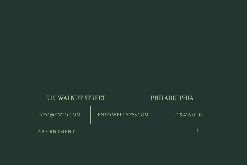
Business card / reverse.
The reverse behaves as a quiet address grid, not a shouting contact block.
Format 85 x 55 mm
System Four-cell address grid
Type Gill Sans utility
Rule One-pixel divisions 23
Ento / Wellness from within Brand Guidelines / Edition 01 / 2026
In the world
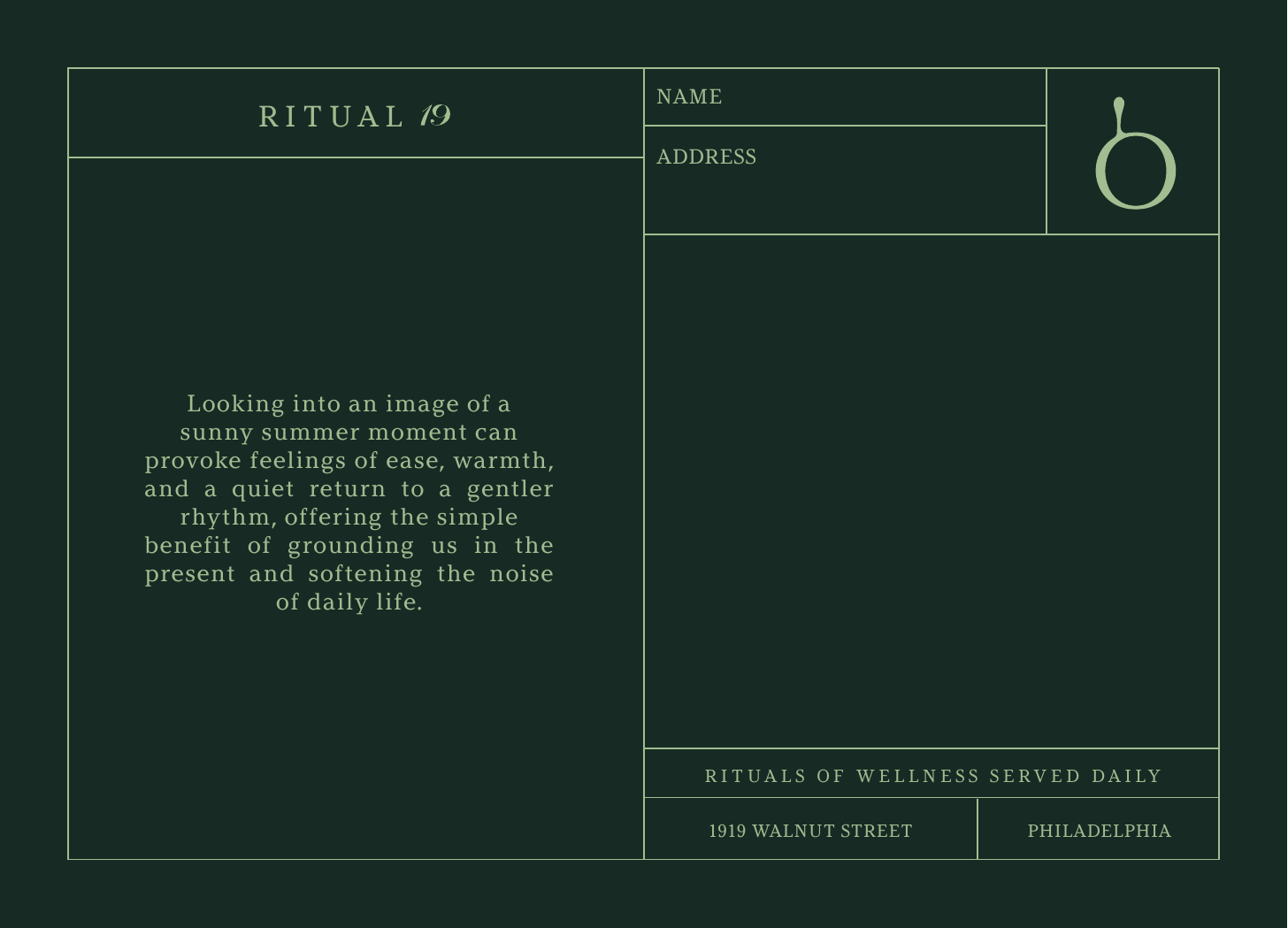
Postcard.
A6 postcard artwork keeps the identity editorial, tactile, and spare.
Format A6
Artwork Client PDF render
Scale 240 DPI source
Use In-room and mailer 24
Ento / Wellness from within Brand Guidelines / Edition 01 / 2026
In the world
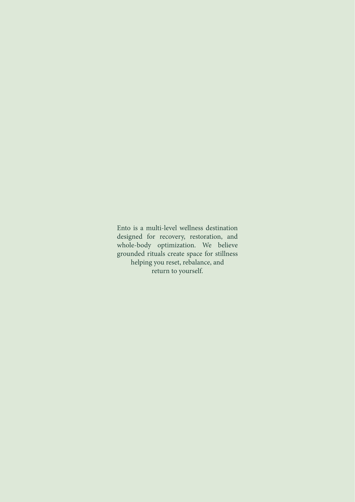
Menu / cover + opening.
The menu system uses silence first, then reveals information in measured layers.
Format A4 menu
Pages Cover and opening
Ground Cream / Green
Source A4 FULL MENU.pdf 25
Ento / Wellness from within Brand Guidelines / Edition 01 / 2026
In the world
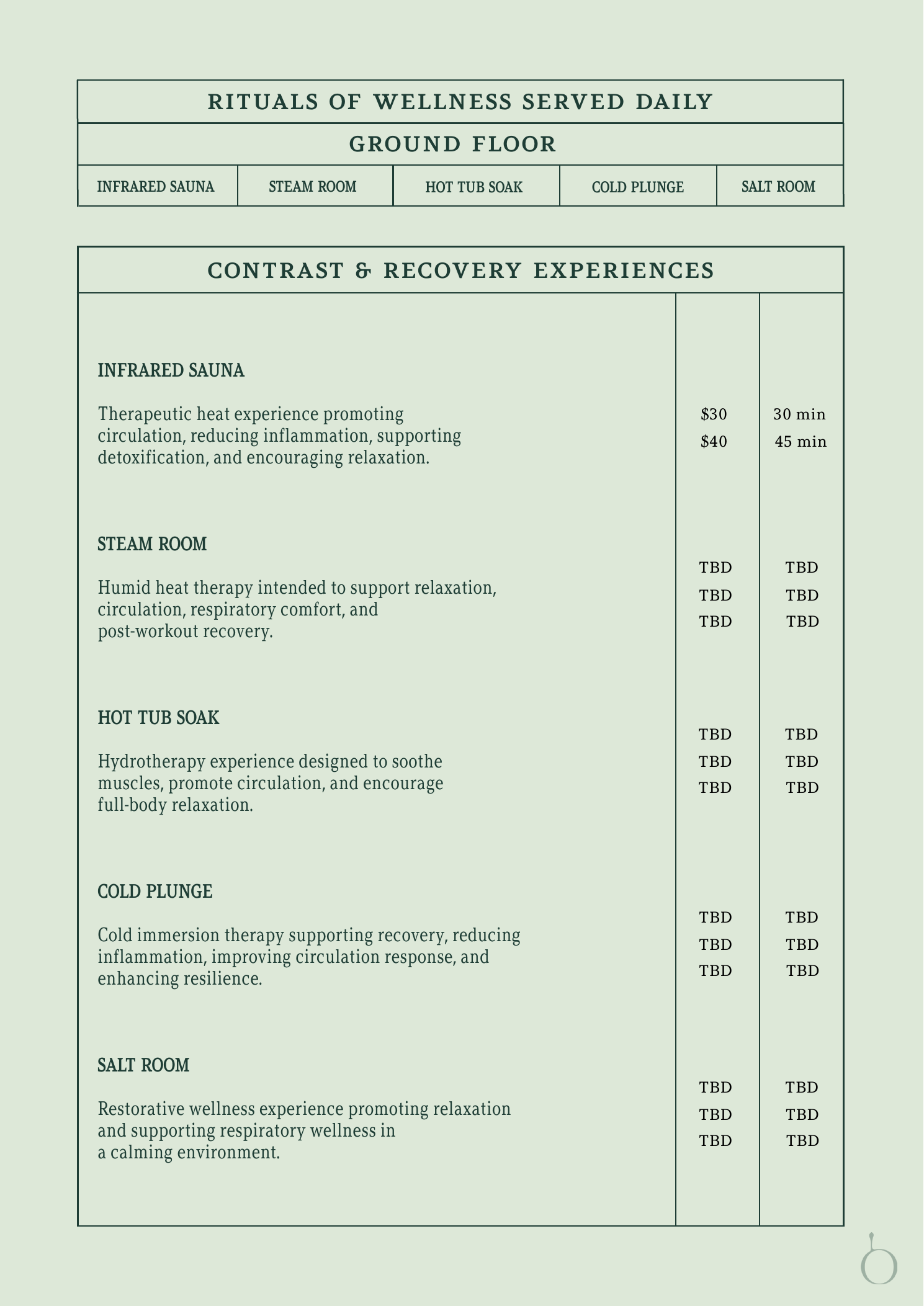
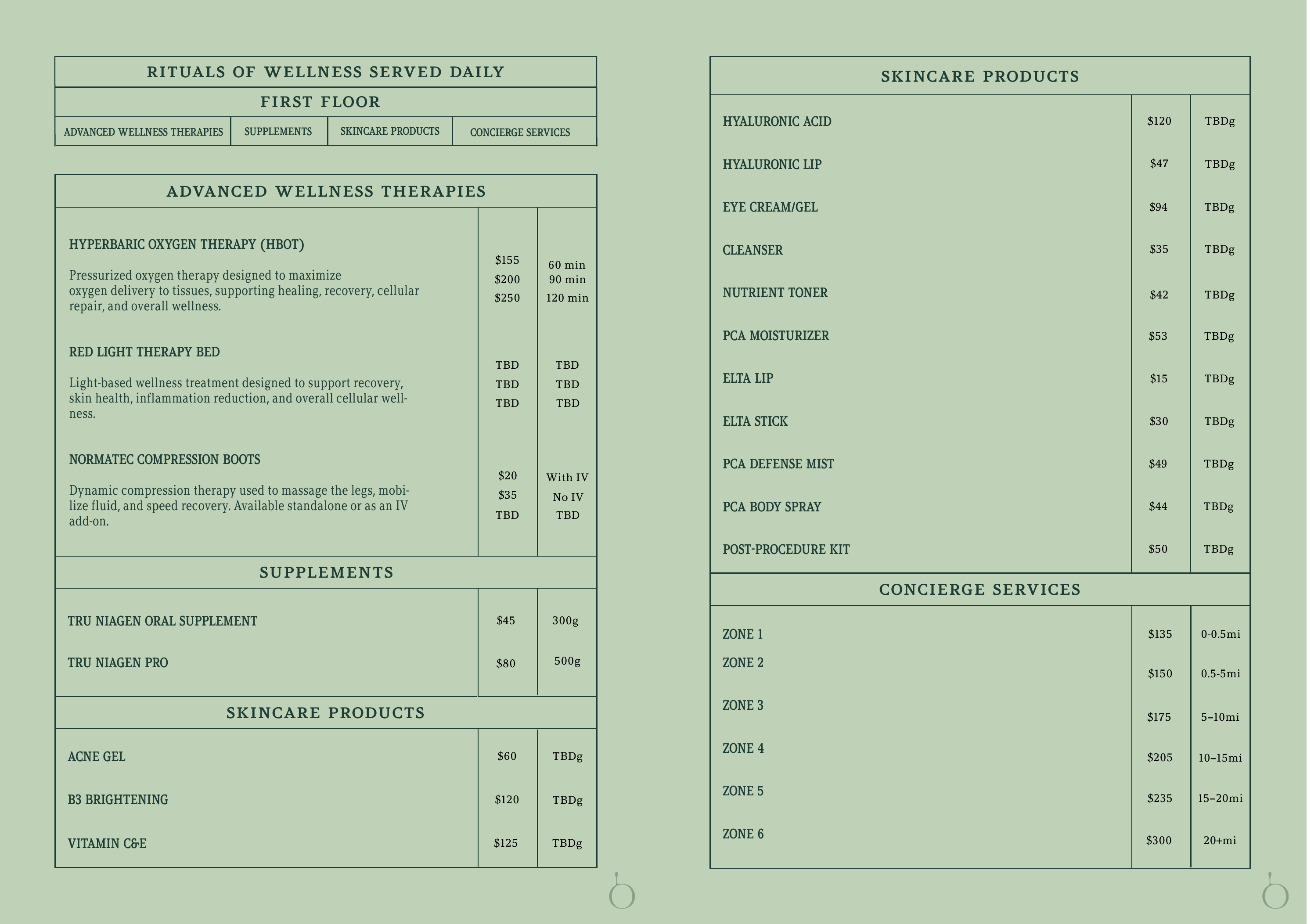
Menu / ground + first floor.
Floor language is functional, but the cadence remains composed and human.
Pages 4 and 8
Role Floor navigation
Image Client PDF render
Rule Do not redesign artwork 26
Ento / Wellness from within Brand Guidelines / Edition 01 / 2026
In the world
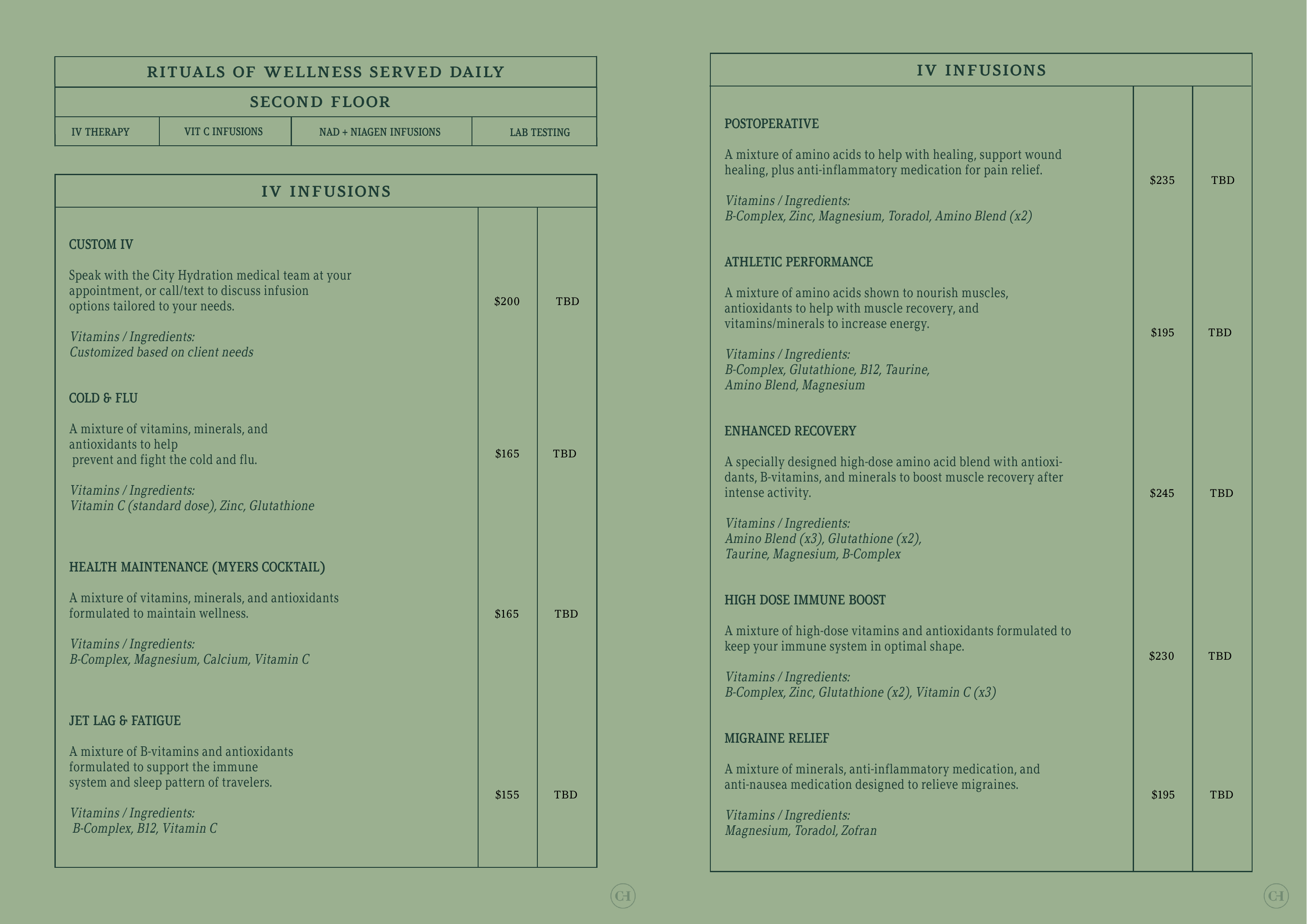
Menu / second floor.
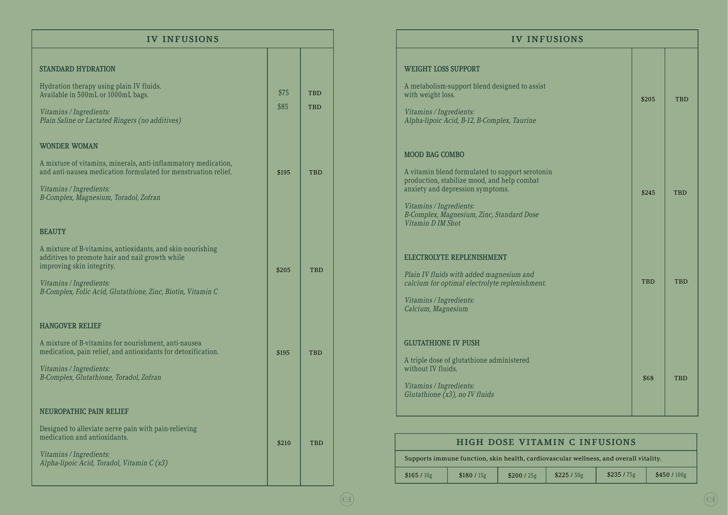
The second-floor spread shows how dense information stays soft through hierarchy.
Pages 12 and 13
Type Gill Sans body
Use Treatment menu
Finish Editorial restraint 27
Ento / Wellness from within Brand Guidelines / Edition 01 / 2026
In the world
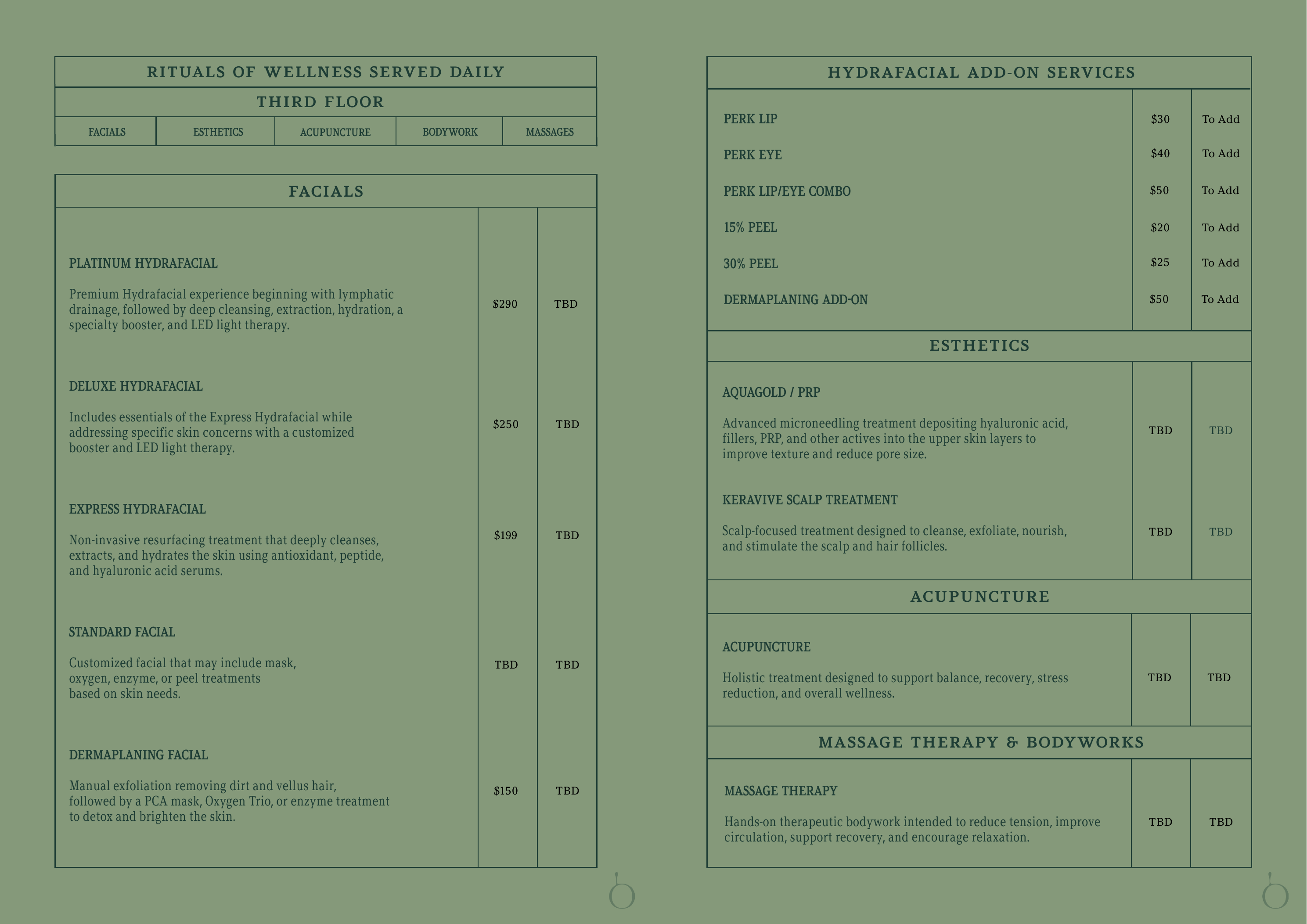
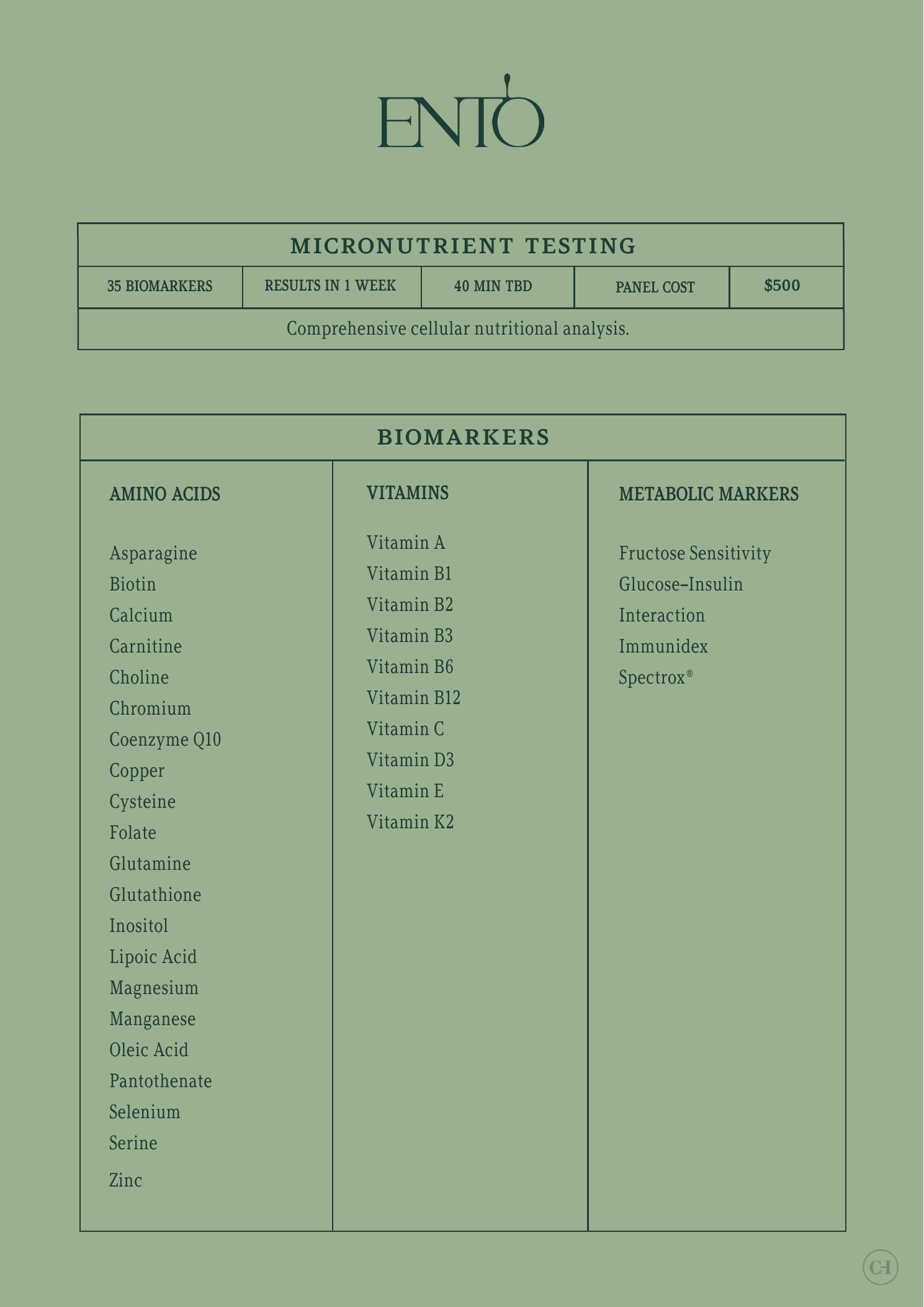
Menu / third floor + micronutrient.
The final menu slides show the system carrying both ritual and detail.
Pages 19 and 22
Content Third floor and micronutrient
Image Client artwork
Status Source of truth 28
Ento / Wellness from within Brand Guidelines / Edition 01 / 2026
Rule 06
Every touchpoint is a treatment.
01
Can it be felt in under 30 seconds? The first read should lower the temperature.
02
Would someone forward it with care? The voice should feel intimate enough to share.
03
Is the signature still quiet? The brand signs the moment. It does not become the subject.
29
Ento / Wellness from within Brand Guidelines / Edition 01 / 2026
Governance
Approvals. Every public touchpoint should pass the three send tests before release.
Frequency cap Protect quiet hours and recovery time.
Three tests Felt, forwardable, signature-led.
One word If it feels noisy, remove it. Inventory
Source files.
Marks HERO.eps / ICON 1.eps / ICON 2.eps
Fonts Argesta, Brown Std, Adobe Garamond, Gill Sans
Palette Pantone 553CP, 2404C, 7527CP, Off White
Library Master asset folder maintained by Ento. 30
Ento / Wellness from within Brand Guidelines / Edition 01 / 2026
Return, gently.
These guidelines are a living document. Keep returning to the feeling before approving the form.
1919 Walnut Street / Philadelphia / ento.wellness.com
31